Analysis Techniques: Flow Duration Analysis Example
|
Information to get started:
- The lesson below contains step-by-step instructions and "snapshots" of what each step
looks like when carried out in a Microsoft Excel workbook. Blue shading of information
in the Excel illustrations denotes changes made from the previous step. Dots placed in
three consecutive rows indicate that a portion of data is hidden from sight.
- You can download an Excel workbook containing the complete data set by clicking on the
"Download Data" link below. It contains
each calculation step on a separate worksheet. To move between steps, click on the
tabs at the bottom of the excel window.
- When you download the file, it may open in your browser window. You may wish to use the
"save as" function to save the file to a local drive and then reopen it in Excel. This
will make it easier to flip between the online lesson and the example workbook.
- Finally, we want to remind you that the techniques explained on this site are statistically
based; therefore results must be viewed as predictions and not as facts. Please use
the techniques and the information obtained from them responsibly!
|
Step 1: Select the time step value (day,
month, etc.)
- For the Alsea Example and Tutorial, the analysis will be done
using a daily time step.
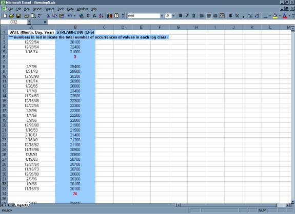
Step 2: Download the chronological record of discharge
(daily values).
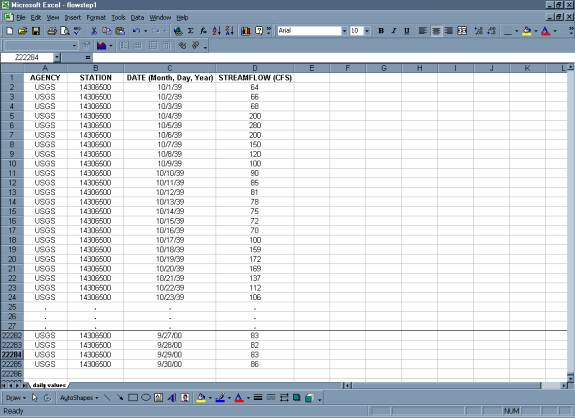
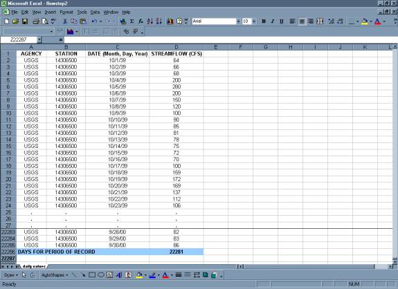
Step 3: Compute the total number of time
step intervals in the period of record.
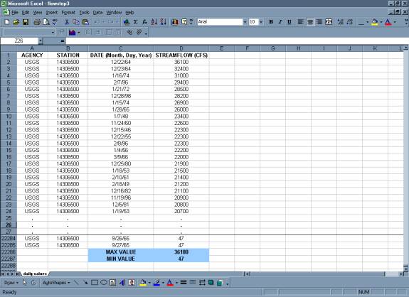
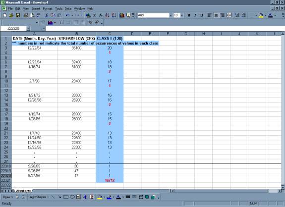
Step 4: Rank Discharge by Magnitude.
Step 5: Divide the range of average values
into classes (class sizes need not be equal)
- It is recommended to have between twenty to thirty class intervals for
the period of record. Classes can either be equal interval or based on
log cycles.
Log
cycles are often used to sort data because the probability of choosing appropriate
interval spacing is higher than if the data were separated into 20 to 30
equal classes. Log
cycles are often used to sort data because the probability of choosing appropriate
interval spacing is higher than if the data were separated into 20 to 30
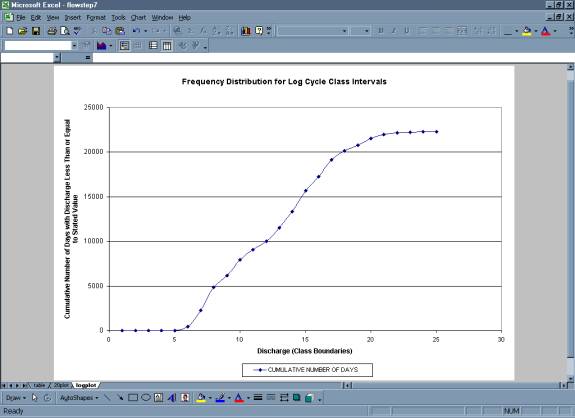
equal classes. A histogram of the sorted data should take on a general bell
shape. If the shape appears drastically different from the bell shape,
the data may need to be resorted into smaller or larger intervals. If
improper intervals are chosen, the amount of information the flow duration
curve can provide is diminished.
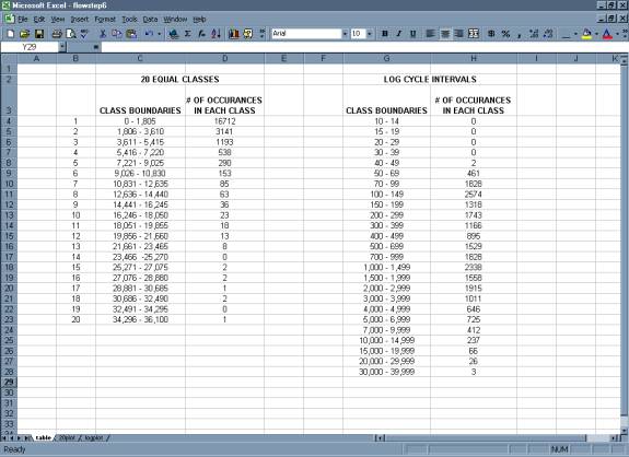
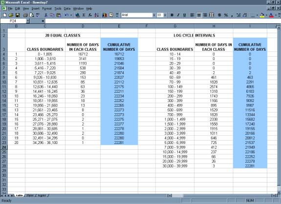
- For the equal interval method, determine the discharge range for
each class by dividing the max discharge value by the desired number
of size classes. In the
example
data, the max discharge value is 36,100 cfs. That value divided by
20 is 1805.
So for twenty size classes with equal intervals
in each class, the smallest size class will be discharges between 0-1805
cfs. The second size class will be 1806-3610 cfs and so on, up to the
max value.
- For classes based on log cycles, select classes of discharge values
based on a spacing of 1, 1.5, 2, 3, 4, 5, 7, 10, or on multiples
of 10 of these values. For the example data, the size classes will
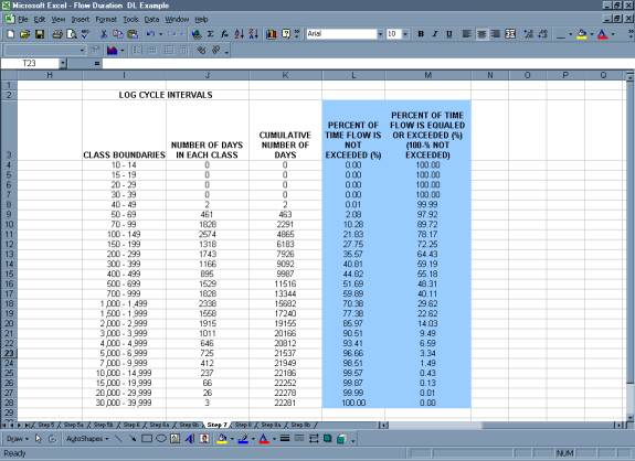
be 10-14 cfs, 15-19 cfs, 20-29 cfs on up to 30,000-39,999 cfs.
- Use the ranked data to count the total number of occurrences of values
in each class.
20 Equal Class Intervals:
Using Log Cycles:
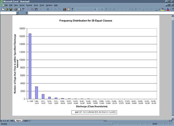
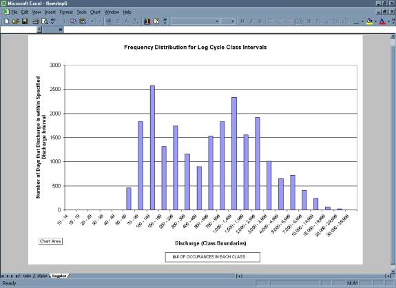
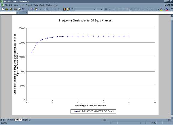
- A plot of the total number of occurrences in each class versus discharge
gives a frequency distribution.
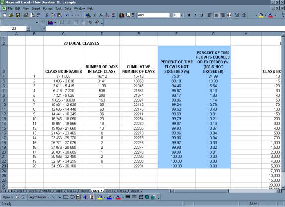
Step 6: Beginning with the upper boundary
of the highest class, add up the total number of values that are greater
than the lower boundary for each successive class.
Step 7: The cumulative number of occurrences
is converted to a percentage of the time.
- Divide
the values developed in Step 6 by the total number of time steps from
Step 2; this gives the frequency with which the lower values of each class
have been equaled or exceeded in the period of record.
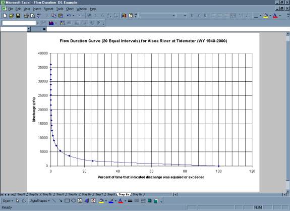
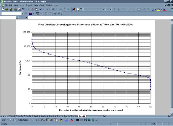
Step 8: Finally the diagram is turned
so that discharge is given on the vertical axis and Exceedence Frequency
is given on the horizontal axis.
|